Marketing Insights
An Overview of Typography
In its essence, typography is how a word looks, including what font (typeface) it is set in, what color it is, and how dramatic and decorative, or how practical, it is. The possibilities are almost endless, especially when you consider hand-lettering (the process of creating letters by hand) and the continual creation of new fonts (Practical Typography). In fact, when faced with the long list of typefaces and fonts available to you, the task of choosing the right one can be more than a bit daunting. Knowing how to look at typography, and the different kinds of messages it sends, can help make the task easier.
Font versus Typeface
Oftentimes the words ‘font’ and ‘typeface’ are used interchangeably. While, yes, the words do relate to the overall appearance of the letters, they each mean something different. A typeface, also referred to as a type family, includes the different variations of the type. The word ‘font’ is the term used to describe the individual variations within a type family. For example, Helvetica comes in different weights and styles, such as light, bold, regular, etc. Let’s say a designer decides to use Helvetica Bold in their design. The typeface being used is Helvetica, while the font is Helvetica Bold. It can be difficult to distinguish whether or not the correct word to use is typeface or font, but once you figure out if you are looking at the overall name for a type family or a specific font within the type family, it can become easier to make the differentiation.
Type Classifications
When you hear the words typeface and font, you might think of Times New Roman, the classic typeface used for school papers, or Comic Sans, the typeface that everyone loves to hate. There are a multitude of type families out there, each as unique as the next, and choosing just one or two can be a real challenge. The appearance of the font has an important influence on which message the viewers receive, based on the mood or tone it sets. Font choice may seem like a small detail, but in reality, it can make all the difference.
Typefaces are commonly divided into categories, such as serif, sans-serif, slab-serif, decorative or display, and script. (Fonts.com)
Serif
When you look at a typeface and can see little feet on specific letters, you are looking at a serif typeface. The aforementioned ‘feet’ (highlighted in red) are called serifs, and vary for each typeface. Popular examples of serif typefaces include Times New Roman, Garamond, Caslon, and Georgia.

Sans-Serif
Sans-serif typefaces are those that do not have serifs on the letters. Popular examples of sans-serif typefaces include Helvetica, Avenir, Futura, and Arial.

Slab-Serif
Slab-serif typefaces are like serif typefaces, except that the serifs (highlighted in red) tend to be blocky and squared out, rather than having the classical curves and fine points seen in ordinary serif typefaces. Popular examples include Rockwell, Memphis, Clarendon, and Museo.

Decorative and Display
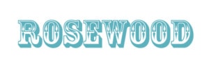
Decorative typefaces usually have more ornate or elaborate letterforms. The letters are sometimes based off of a theme, and sometimes the typeface is meant to be used for a specific mode of display, such as a logo, poster, header, etc. Examples of display typefaces would be along the lines of the Star Trek typeface used in its logo, Rosewood, and Hobo.

Script
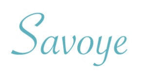
Script typefaces are usually cursive or have a more handwritten feel in their overall design. Blackletter typefaces are also considered script. Blackletter typefaces are bold, elegant letterforms that contain a decorative element and usually have a high amount of contrast within the strokes of the letterforms. Examples of script and blackletter typefaces include Brush Script, Savoye, Edwardian Script, and Goudy Text.

To learn more about type classification, check out Fonts.com’s breakdown of type classification by clicking here.

Choosing the Right Typeface
Determining the message you are trying to send and how it will be sent are perhaps two of the most important aspects in choosing the right typeface. Each typeface will give viewers a specific feeling, and knowing how you want your viewers to feel will help you narrow down the choices (Fortis). If you are looking to convey a classic, traditional, or professional vibe, try a serif typeface. If you are looking for something more contemporary, check out sans-serif typefaces. Overall, the message that you are trying to send and how easy the font is to read will be the driving factors behind your choice of type. One of the best ways to find the right typeface is to experiment with a variety of them. When you find one that fits and feels good with your brand content, you will know that you have found the right type to work with.
Other important factors to consider when choosing a typeface and putting it to use are the size and the spacing. When typing a headline, for example, you might track out the text (tracking is the horizontal spacing between a group of letters). That is something you should not do in the body copy since it can become difficult to read in long paragraphs. (Creative Bloq)
When looking for the perfect typeface, the method of delivery is also important. Breaking down how the fonts will be used on the web or in print is very important. Fonts, like many other graphic elements, are subject to particular copyright laws. Some fonts are meant to be used on the web, and some are meant to be used in print. A great resource for finding web fonts is Google Fonts, which provides free and open-source web fonts for designers & developers to use when creating websites (Google Fonts). The site even has code snippets that can be used to easily link to their extensive library, making it possible to load fonts from the Google collection onto your website.
 Typography in Branding
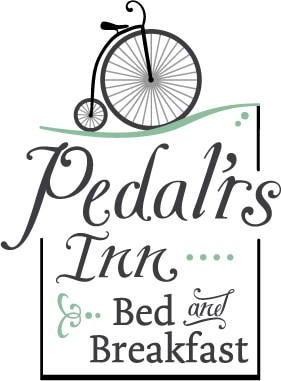
Besides color palettes and logo, typography is one of the most important parts of a brand. Which fonts are used by a brand can tell viewers much about what kind of brand it is and who its target audience is. Some brands even rely on typography within their logo. Oftentimes, custom or modified fonts are used to represent a company, as seen in the LEGO and Coca-Cola brands (Complex). If your logo utilizes type rather than just a symbol, it is important, much like when choosing a font for anything else, to assess who your target audience is, what your company does and values, what competitors are doing, and the message you want to convey. If you are opening a small, locally-run coffee shop, for example, you might want to consider something warm and inviting. If you are opening a computer store, you might want something more modern to help sell your brand.
Along with typeface choice, it is also important to consider which colors and images, if any, it will be paired with. Brand consistency is an important goal to pursue because it allows people to create an instant connection with your brand rather than trying to keep up with constant changes in identity.
Conclusion
Typography and the written word has a long history—one that has greatly influenced modern type usage and design. We have provided just a brief overview of typography and a few of the aspects involved in making type decisions. If you are interested in learning more about typography and choosing the right fonts for your brand, contact Ocreative to get started with your branding.
About Ocreative
Bright, honest, digital innovators and creative gurus, Ocreative is recognized as an International award-winning, full-service, integrated marketing agency. Since 2003, they have been getting big results for their trusting clients and that puts big smiles on everyone’s faces. Ocreative is headquartered in Wisconsin, but their clients are located all across the United States, from Massachusetts to Hawai‘i. Ocreative’s expertise and portfolio include marketing and strategy, advertising and design, websites and digital and video and multimedia.

