Marketing Insights
The Evolution of a Brand
As the philosophers say, change is the only constant in life. Life is flux, and people evolve to progress. The brands that people depend on need to evolve, too. Logo identity is a vital part of any company’s brand. A brand sets the company’s tone, image, and expectations. Take the example of when you see Colonel Sanders, you think of crispy, delicious fried chicken. When you see the Nike swoosh, you think of quality active wear.

Milwaukee Brewers Logo Evolution
Milwaukee Bucks Logo Evolution

Microsoft Logo Evolution
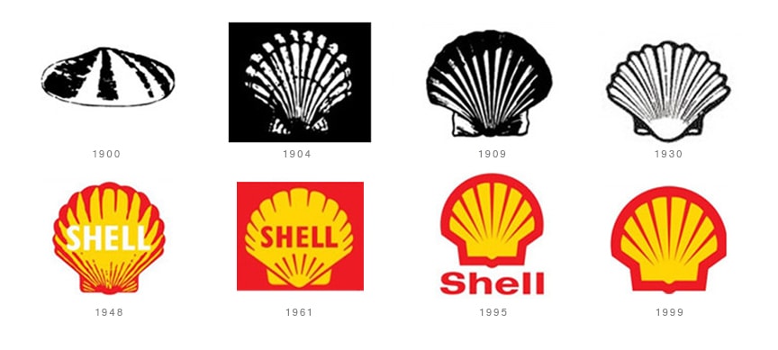
Shell Logo Evolution
What is a logo?
Have you ever thought about what the word logo means and where it came from? In Greek, logos means `the word’ and `to speak,’ and it can also refer to `conveying a thought.’ Refreshing the word, the visual, or the thought behind the logo can infuse new life into a company and drive up sales. It is also part of the visual that helps to build strong brand loyalty. For example, it might surprise, delight, or educate the audience as it begins to tell the story of your brand, mission, and principles.
Apple Logo Evolution
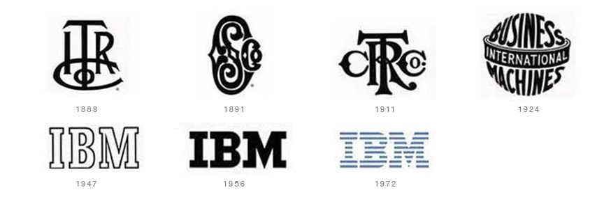
IBM Logo Evolution
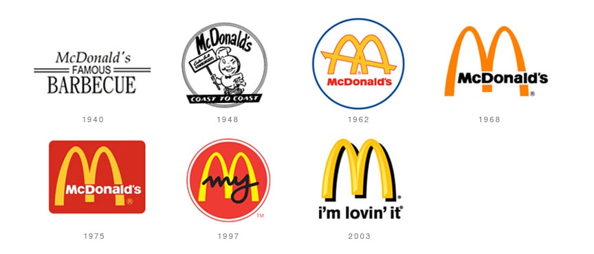
McDonald’s Logo Evolution
What makes for an improved logo?
Many factors can go into improving a company’s corporate identity. Like everything else in corporate society, styles change, attitudes change, and even type styles can change. Over the last twenty years, a simpler visual design for logomarks has emerged—specifically, one that is versatile and memorable without being overdrawn. Companies such as Starbucks, John Deere, and Shell have used bolder logo icons in place of their full names or shortened their names. For example, Kentucky Fried Chicken is now known as just KFC. Shortening to acronyms, however, should be done with caution because if your logo says KFC, don’t rely on new customers remembering what KFC stands for after several years.
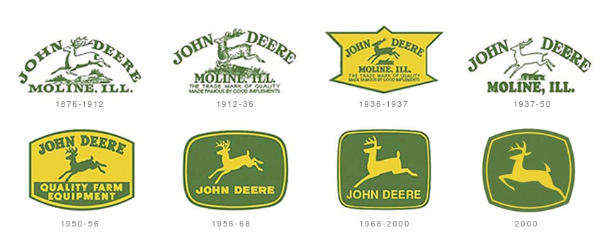
John Deere Logo Evolution

KFC Logo Evolution
But one of the most interesting logo icons to evolve is the photographic image of Betty Crocker over the years. Although her burgundy-colored blazer remains consistent, her hairstyle, demeanor, and general mood have transformed many times over her 80+ years to reflect what is fashionable. But unlike any of us reading this article, Betty Crocker hasn’t seemed to age a day.
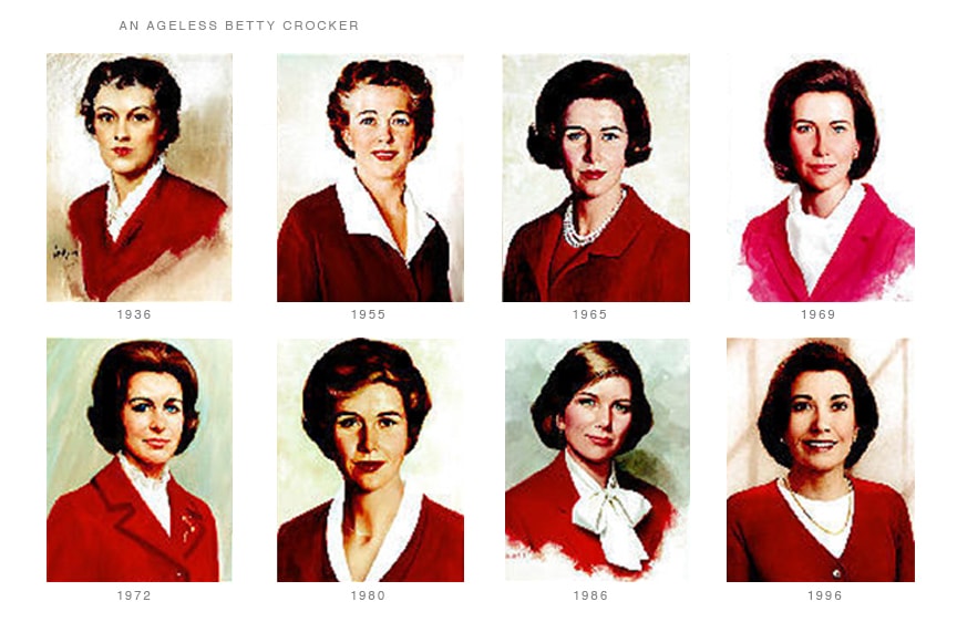
Betty Crocker Logo Evolution
What is your brand identity and personality?
Has your brand evolved with time? Take some time to look at your brand and decide if you’re ready for a refreshed logo.
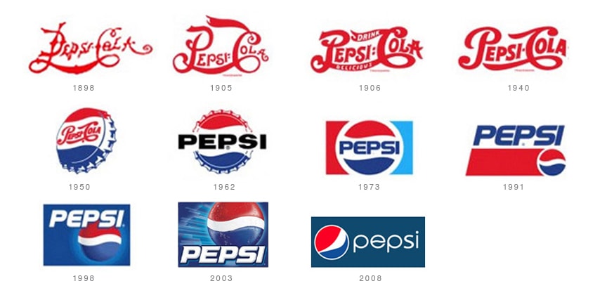
Pepsi Logo Evolution
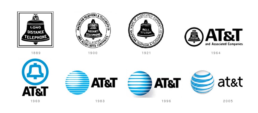
AT&T Logo Evolution
About Ocreative
Bright, honest, digital innovators and creative gurus, Ocreative is recognized as an International award-winning, full-service, integrated marketing agency. Since 2003, they have been getting big results for their trusting clients and that puts big smiles on everyone’s faces. Ocreative is headquartered in Wisconsin, but their clients are located all across the United States, from Massachusetts to Hawai‘i.

* The respective logos, trademarks and registered trademarks cited herein are the property of their respective owners.


