Marketing Insights
Automatic Image Sliders or Carousels: More Confusing Than Informative
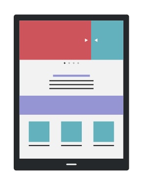
Website developers continually seek new and innovative ways to display information that reaches audiences in an efficient and effective way. Occasionally, usability and design meet to create a new layout or format that revolutionizes the way websites are built. Some updates, however, seem useful in theory, but are not in practice. One recent trend uses automatic image sliders or carousels that seem useful for providing a large amount of information while taking up limited space above-the-fold. The moving images and additional text, however, are generally disregarded by users because they find them distracting or assume they are ads. Those that do look at the automatic image slider only interact with the first slide, rendering the remaining slides are irrelevant. Finally, carousels reduce accessibility for major user groups reducing the general effectiveness of the website overall.

 The Neilson Norman Group, arguably the most recognized usability research group in the world, recently did a study evaluating the effectiveness of image sliders as headers for websites and found that they are not a useful design tool. In fact, few users look at them, and those that do, find them distracting. According to the study “It’s just plain annoying for users to lose control of the user interface when things move around of their own accord.” The NNGroup expands: “Carousels should show a new panel only when users ask for it. Otherwise, it should stand still and let users read the information in peace, without having the rug yanked from under them.” Most users also feel the rapid movement, change in visual landscape, and overuse of text signify a banner ad and ignore the header altogether: “…Most important, because it moves, users automatically assume that it might be an advertisement, which makes them more likely to ignore it.”

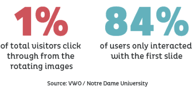
Notre Dame did a similar study – testing their own website’s carousel header finding that only 1% of total visitors click through from the rotating images. In fact, 84% of users only interacted with the first slide, rendering the remaining slides useless. Even if the website does not automatically move the slide as suggested by Neilson above, and allows users to participate at their own pace, there is no incentive for users to interact and they will move on to other areas of the website. As more than 84% of users do not interact with secondary or tertiary slides, we can assume that information is lost. Designers reserving key information for header carousels are actively nullifying the information’s effectiveness by putting it on sections of the website users will never see. If information is important for users, put it out front and keep there.
While some users choose to disregard automatic image sliders, there are large user groups who simply cannot interact with the interface. According to the Neilson Norman Group “Moving UI elements usually reduce accessibility, particularly for users with motor skill issues who have difficulty clicking something before it’s taken away.” Many companies spend time and effort making their websites accessible and compliant with ADA requirements.

A moving header can severally limit users with motor skill issues from accessing key information if it is provided on an automatic slider. This is not the only group limited by carousels – the NNGroup continues “Low-literacy users often don’t have enough time to read the information before it’s removed” and that international users tend to read more slowly if the site is not in their native language, “and thus they won’t be able to understand a panel if it’s displayed only briefly.”
As a web design agency, we are often asked if we can produce carousel headers, and while the answer is yes, we strongly discourage their use. Websites are generally meant to be engaging and provide useful information in a meaningful way to help users achieve whatever the objectives of the site may be. To create the best user experience, highlight the most important information in static sections of your website that can be easily viewed. Understanding user trends, evaluating information layout and display, and writing copy that is effective is no small undertaking. If you are unsure of the usability and accessibility of your site, contact Ocreative for a consultation.
About Ocreative
Ocreative is a Milwaukee marketing agency, with expertise and broad experience in developing digital marketing strategies, and growing their online presence, for their clients. The company’s core values include offering the highest level of customer service, award-worthy quality, and performance that surpasses client expectations. Ocreative is located just outside Milwaukee, and works with clients locally, nationally, and globally. Their clients have access to some of the most fun and knowledgeable professionals around – ones who inspire, educate, and problem solve. The agency provides marketing and brand strategy, advertising and design, website design and social media, and video expertise to their clients, fulfilling their desire for business growth, and their aspiration to make a mark on their industry.

