Marketing Insights
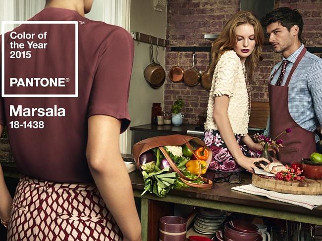
A Look at Marsala, the 2015 Pantone Color of the Year
 Marsala feeds the mind, body and soul.
The 2015 Pantone Color of the Year is infused with the energy of red-wine and because of it’s strong undertones of brown, it further radiates characteristics of confidence and strength and feels a natural and comfortable.
In previous years, we saw Tangerine Tango, a color which helped us recharge during the challenging economic times of 2012. In 2013, we met Emerald, a color that helped our well-being and our balance while giving us harmony and renewal. In 2014, we needed to boost creativity, originality and confidence and we found that with Radiant Orchid. Looking forward to 2015, we needed a color that fits with us ‘right now.’ In an age of loudness and technology, Pantone’s in-depth color research, which spanned across several industries, identified that there was a need for people to pull back to a quieter, more comfortable place where they could find contentment and warmth. This feeling can be had in the color, Marsala, the 2015 Color of the Year, and member of the brown color family.

Adding texture to the Marsala layers in additional meaning and color depth. With a matte finish, it speaks to earthiness and the feeling of being grounded. With a gloss or shimmery finish, it speaks to a natural sophistication and elegance. This depth of meaning, and how it changes with texture, allows the color to be versatile in the way that it expresses moods and works seamlessly across design industries and applications.
I’ve never met a color that I didn’t love, but I must admit, when I first heard the news announcement about the new Pantone Color of the Year, I felt a bit confused as to why it had become the choice. Looking back, I believe it was because I had become accustomed to Pantone choosing brighter colors for their Color of the Year selection that I felt a slightly “off-balance” when Marsala was announced. After discussions with my color colleagues and listening to the executive director and the vice president of the Pantone Color Institute talk about the color, I now understand the choice and the research behind the selection. For someone who personally likes when things are new and different, change isn’t always easy. In fact, change can be down-right hard but once you open your mind to the idea of change, it can be so rewarding. I am now in love with this color and it’s versatility and I do agree with Pantone that we will see this color infiltrate quickly in the market.
Marsala, a Versatile Color that Layers Well
The brown family is a family of colors that are built to last — think leather, chocolates, coffee and earthy-rich browns. Even those who love light colors find themselves decorating using colors from the brown family in their wood furniture, flooring and natural accents. Marsala is a beautiful red-infused brown that can be layered with bronze, metallics, umbers and even the other side of the spectrum with blues. Marsala works very well in make-up and hair color because it compliments many skin tones and also pairs well layered with other colors. You’ll also see Marsala in leather shoes and purses, in suede, shimmery and silky clothing, and in home decor products. You’ll see it in wearable tech like headphones, in print and on the web in corporate brand identity colors and more. Marsala’s own name was inspired by wine and foods so, of course, it also works well to stimulate the appetite in kitchens and dining rooms. You’ll even see a Keurig 2.0 coming out with a Marsala colored coffee brewer!
Check out our Pinterest board for examples
and color pairings with Marsala
Follow Ocreative’s board: Marsala Pantone Color of the Year 2015 on Pinterest.
Further Reading & Discussion
Watch the video above where Leatrice Eiseman, the executive director of the Pantone Color Institute, discusses Marsala in this 2015 Color of the Year interview. You can read further about the hearty and full-bodied Marsala color directly from Pantone.
Of course, I’m happy to discuss the color further. Please leave your comments below.
Let’s chat about a color consultation for your company’s products or brand.
 Andrea Koeppel is the owner and creative principal at Ocreative. An award-winning graphic designer, Andrea founded Ocreative in 2003. Her philosophy is that good creative captures attention but great creative captures both attention and results. Get to know Ocreative.


