The digital landscape continually changes based on shifts in user expectation and design trends. Websites are especially susceptible to frequent changes in format, function, and style as design and development firms across the globe continue to innovate better user experience practices. According to a recent article published by the American City Business Journal, “Many experts will tell you to update your site every two to three years at a minimum. However, you may need to redesign or refresh your website more often.” We couldn’t agree more. We tasked our web development team to identify the top ten web design trends for 2019 and we’re leaking our insights a month before the ball drops on this year. Use the following trends to determine if your website is ready for a refreshed new look and interface for the new year.
1. Mobile Friendly Web Design
While mobile-forward web design has always been crucial for business success, having your business available to as many people (and their devices) as possible remains the highest priority for maximum success in 2019. With the myriad of technological devices in today’s world, almost anyone can access the internet at any time from nearly any location. As a result, having a truly mobile-responsive website is absolutely necessary. Analytics tell us that websites that are not mobile friendly have a much higher bounce rate on mobile devices. This means potential customers/clients navigate elsewhere for the type of services they are looking for rather than fight through a clunky, frustrating mobile browser experience. We’ve been saying it since 2010 (when people thought we were crazy) and we stick by it now – mobile optimization is key.
2. Broken Grids
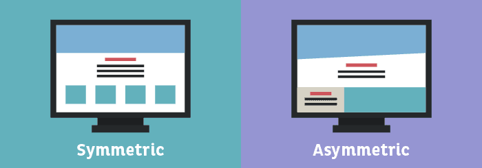
Broken grids, also known as asymmetrical layouts have become an incredibly trendy design style that has grown quickly among websites in the last few months. This kind of layout stands out from traditional web design because it breaks conventional design rules — moving content outside of traditionally parceled containers, without being distracting or sloppy. This style of layout includes:
- Use of unusual placements
- Layering with different colors and textures
- Repeating irregular patterns
- Use of white space
- Creative use of typography to create a sense of depth not normally found in grid-based layouts.
3. White Space
As noted above, the intentional use of white space is growing in popularity. In that past, white space was considered a negative visual asset and would generally be filled with text or a graphic of some kind. That type of excessive content use, however, is the reason why white space (also known as negative space) has become increasingly integral in contemporary web design. The use of white space produces a calming effect, allowing the viewer to easily digest the information on a screen without being distracted or overwhelmed by gratuitous content.

White Space Fast Fact:
There are two levels of negative space to consider in web design: micro and macro. Micro negative space is related to the space between small elements like lines, words, and letters. Macro negative space is the space between larger blocks or elements.
4. Card-Based Layouts
Card-based layouts give websites an opportunity to showcase a large amount of copy or images in a more organized manner to tell a narrative more quickly. The use of visual breakpoints between page elements removes clutter despite the large amount of content on a page. Most significantly, card-based design is a great replacement for the out-of-date and ineffective page slider function that many websites currently use.
5. Color Blocking
Color blocking, while not a new concept to design in general, is a technique that involves the use of different colors to create a mosaic effect. New to web design, color blocking can be used on both content and image-heavy pages to break up elements and give them room to breathe, creating resting points for the eye.
6. Micro Animations
Micro animations are a powerful way to provide an intuitive experience to a user as they browse a website. This feature is accomplished through small animations that help the user understand the site and validate their user actions when they navigate their mouse over or click on an element. These animations could include an icon that changes in size or other visual changes when the user hovers over it or clicks it.
7. Chatbots
Chatbots are a technical function that creates an automated chat-style communication between consumer and business that uses automated or pre-determined responses or functions. Chatbots provide several opportunities to help users have a more valuable experience on a website. Some advantages of this feature include:

Providing instant responses

Resolving a complaint

Answering frequently asked questions
Being available 24/7
8. Interactive Backgrounds
Videos and interactive backgrounds are growing in popularity because they give brands the opportunity to make a memorable impression by quickly grabbing the user’s attention. While users tend to gloss over static images, a moving or animated piece draws the eye and bring focus to key elements on a page.
9. Load Speed
Speed is something most users expect when it comes to browsing websites. With the amount of information available and sources for that information, users will only spend about three seconds waiting for a web page to load. Excessive amounts of content can cause a major increase in loading time if not optimized correctly. Growing use of mobile devices to surf the web has made load speed a crucial factor in the effectiveness of a site.
10. Material Design
Material design is another stand-out website layout trend for 2019. The design concept includes the strategic use of geometric shapes to create a new visual flow to a page. It is an innovative way of designing to create a hierarchy of meaning and importance to information on any given webpage.
If you are interested in giving your website a new and innovative look for 2019, contact Ocreative!
About Ocreative
Ocreative is a Milwaukee marketing agency, with expertise and broad experience in developing digital marketing strategies, and growing their online presence, for their clients. The company’s core values include offering the highest level of customer service, award-worthy quality, and performance that surpasses client expectations. Ocreative is located just outside Milwaukee, and works with clients locally, nationally, and globally. Their clients have access to some of the most fun and knowledgeable professionals around – ones who inspire, educate, and problem solve. The agency provides marketing and brand strategy, advertising and design, website design and social media, and video expertise to their clients, fulfilling their desire for business growth, and their aspiration to make a mark on their industry.


