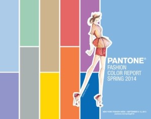
Today is an exciting day for color as the Pantone Color Report for Spring 2014 was released to coincide with New York Fashion week. Pantone’s stunning new colors for spring 2014 include a season of colorful equilibrium: Dazzling Blue, Violet Tulip, Hemlock, Sand, Placid Blue, Cayenne, Freesia, Celosia Orange, Paloma, and Radiant Orchid.

It’s exciting to see the pastel and neutrals combine with vivid colors. The result is a palette that’s fresh and full of life. Celosia Orange, Placid Blue, and Sand — are all colors we used to paint our new Ocreative office. It’s exciting to see those colors appear on our walls as well as the Pantone Spring Color 2014 report. Living within walls that are those colors, we can completely understand why these hues made the top of the list. The contrast of the exciting, vivid, and bold Celosia Orange and the calming, pastel Placid Blue create an au courant look.

I always look forward to the color trending reports. It’s exciting to see how designers around the world are creatively using similar colors and unexpectedly combining them to make their color palettes stand out. For example the percentage of designers using each of the colors is interesting:
Dazzling Blue 17.05% of designers using this color
Violet Tulip 16.47% of designers using this color
Radiant Orchid 15.88% of designers using this color
Celosia Orange 10% of designers using this color
Freesia 8.24% of designers using this color
Cayenne 7.65% of designers using this color
Placid Blue 7.06% of designers using this color
Paloma 6.47% of designers using this color
Sand 5.88% of designers using this color
Hemlock 5.30% of designers using this color
To read the official press release, Pantone Fashion Color Report Spring 2014.
The report is available for free download at www.pantone.com/spring2014.
(Photo: http://photos.prnewswire.com/prnh/20130905/SF73515)


