Marketing Insights
Color Psychology – What is it All About?
We’ve discussed the importance of information architecture, how to build better websites, and how to amplify your brand messaging, but there’s a more subtle layer to marketing that’s often overlooked or misunderstood. Color psychology plays an important role in the effectiveness of marketing campaigns—setting the tone for both digital and print projects. In fact, research shows that the proper use of color increases brand recognition by 80%. It also enhances the visual appearance by 93%. And even further, 85% of consumers say they buy because of color. (Color Psychology)
But isn’t color an objective experience? Who decides what colors are “in” and what they mean? The study of color hues as a determinant of human behavior, known as color psychology, suggests that color influences perception, even those that are not obvious, such as the taste of food. (UX Planet) The earliest forms of color psychology date back to the ancient Egyptians, as they studied the effects of colors on mood and used them for holistic development. This theory is woven throughout the evolution of psychology, most notably, with founding father of modern psychology, Carl Jung. The Swiss psychiatrist noted that humans have a special connection to colors: “humans have a universal, bodily response to color stimulus” stating that “colors are the mother tongue of the subconscious.” (KeyColour). There are experts that have studied the perceptions of color through our past down through our DNA and theorize that our “intuition” about a color is imprinted in our psyche on a subconscious level. (Leatrice Eiseman, The Color Answers Book)
We know what you’re thinking – “that sounds… complex” and you’re not wrong. Except, on a very basic level, anyone can understand color psychology by recognizing their own attraction or aversion to colors noting your own personal experiences with color along the way. Imagine living in a home with just red lighting – that sounds… stressful. When you think of your most calm environment, what’s around you? Are you envisioning soft blues like the ocean or sky? Maybe you’re picturing the vibrant green of plants and leaves. The truth is, we all have connection to specific colors because our minds associate feelings with the colors we see. Colors are inherent to our environment and as such, we create emotional ties to what we see.
Our certified Color Expert, Andrea, shared with us the emotive and physical effects of the most commonly recognized color families and the theory behind it:
Red
can increase energy, helps to energize the organs and blood circulation, which can promote healing. Red also heightens our emotions and senses like hearing, smell, taste, site, and touch.
Keywords associated with the red family are daring, aggressive, passionate, and emotional.

Orange
triggers mental activity and creative thinking, it induces cheerful emotions, increases energy and uplifts mood. Orange takes on elements of both red and yellow because it is created from both colors. It is less intense than red but remains vibrant and charismatic.
Exposure to orange light can help enhance the immune system, lungs, and kidneys, and can stimulate the nerves and thyroid gland. Exposure to orange is also known to help relieve cramps and spasms.

Yellow
activates mental concentration and clarity and promotes cheerfulness, playfulness, and optimistic thoughts.
Physiologically, exposure to yellow light can help reduce muscle pain and inflammation, build collagen, and stimulate nerves and the immune system. It also helps to speed digestion – notice any favorite food chains using yellow in their décor?
Green
is known to provide emotional harmony. Exposure to the color and help balance the body, lower blood pressure, and relax the heart. It’s considered a healing color.
Blue
can help to ease symptoms of pain, anxiety, and depression. It helps to calm strong emotions like anger and aggression. It tends to be one of the most preferred colors universally between genders.
It is a color of tranquility and peace and is associated with trustworthiness and reliability. Blue, most notably, works to soothe the whole body, relieve migraines and headaches, lowering blood pressure, and calm inflammation.
Purple
to many, has the aura of mystery and intrigue because it embraces both warm and cool tones uniquely balancing conflicting and opposing traits. Often connected with the spiritual, represents creativity and imagination and is associated with renewal, and higher self-connection.
As violet light, it’s known to sooth the nervous system and mental functions, helps to overcome sleeping disorders, stimulates appetite, and promotes meditation while reducing anxiety.
White
recognized as a clean slate, white promotes balance and harmony. It also signifies innocence and simplicity. White is generally associated with purity, cleanliness and safety, creating space for creativity and healing.
Our explanations about the color families listed above do not always apply every color within that family. Color experts look not only at the undertones of each color they also study how colors shift along their spectrum. As colors change, they can take on additional meaning, new messaging, or reinforce certain aspects of the color even further. It is also important to review the context in which the color is being used because different groupings and presentations can affect the messaging.
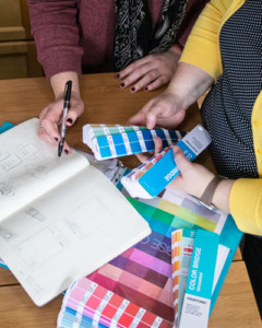 When we work with our clients to develop branding, websites, and print work, we always like to consider the goal of the project, the target audiences, and the content to create a color palette that amplifies and reinforces the messaging. We love to help new businesses find their brand identity through color as much as helping existing businesses self-reflect and update their branding. Even when working within existing brand standards, it’s important to analyze the existing colors and utilize them in a way that maximizes benefit.
Fun fact: Pantone’s color of the year for 2020 is PANTONE 19-4052 Classic Blue. We use Pantone as the gold-standard for color selection and theory because they provide a universal language of color that enables color-critical decisions through every stage of the workflow for brands and manufactures. (Pantone) Pantone actually revolutionized the printing industry with the PANTONE MATCHING SYSTEM®, which is a tool that enables the faithful selection, articulation, and reproduction of consistent, accurate color anywhere in the world.
If you’re interested in learning more about color, would like to analyze your existing brand colors, or are looking to build your brand, reach out to Ocreative. It’s one of our favorite topics and we’d love to chat!
About Us
Ocreative is a Milwaukee marketing agency, with expertise and broad experience in developing digital marketing strategies, and growing their online presence, for their clients. The company’s core values include offering the highest level of customer service, award-worthy quality, and performance that surpasses client expectations. Ocreative is located just outside Milwaukee, and works with clients locally, nationally, and globally. Their clients have access to some of the most fun and knowledgeable professionals around – ones who inspire, educate, and problem solve. The agency provides marketing and brand strategy, advertising and design, website design and social media, and video expertise to their clients, fulfilling their desire for business growth, and their aspiration to make a mark on their industry.

