The Thoracic Surgery Foundation

LOGO  |  COLOR CONSULTING  |  BRAND STANDARDS GUIDE

Designing a Visual Identity for the Charitable Heart of STS

The Thoracic Surgery Foundation (TSF), the philanthropic arm of the Society of Thoracic Surgeons (STS), partnered with Ocreative to develop a new brand identity that would honor their long-standing legacy while positioning the organization for modern engagement, visibility, and growth.

With roots dating back to 1988, TSF had evolved considerably, but its visual identity had not. They needed a mark that conveyed compassion, innovation, and momentum, while feeling deeply connected to STS and recognizable within the medical community.

Thoracic Surgery Foundation
Doctors Performing Surgery

The Approach

Through an in-depth discovery and survey process with TSF’s leadership and board, we uncovered core themes that shaped the design: generosity, excellence, impact, and humanity. The new brand needed to feel hopeful yet professional, timeless yet energetic.

We also understood the importance of connection, visually and conceptually, to STS. Our goal was to create a logo and palette that could stand confidently alone while working seamlessly within the broader STS ecosystem.

THE IDENTITY

The new TSF logo is both symbolic and strategic. Composed of flowing linework, the mark echoes the anatomy of the thoracic region, a pair of lungs enveloping a heart. But it also tells a deeper story: of two human figures in motion, leaning in, as if to perform surgery or offer care. At the center is the heart, bold, compassionate, and unmistakably charitable.

To ground this visual storytelling, we paired the mark with a strong, clean sans-serif font and a stacked wordmark structure that reflects both clarity and cohesion with the STS brand.

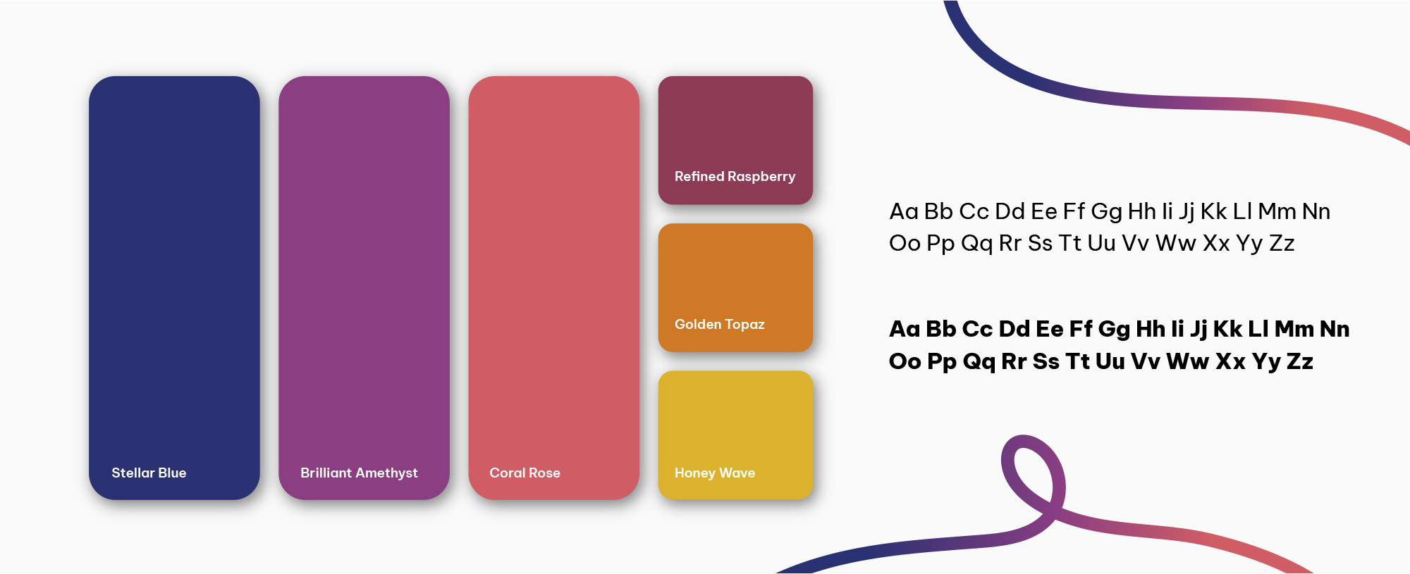
The accompanying color palette weaves together Stellar Blue, Brilliant Amethyst, Coral Rose, and Golden Topaz, tones that reflect professionalism, warmth, gratitude, and vitality. This rich blend allows the identity to feel just as much at home on medical grants and program brochures as it does at donor events or social campaigns.

In Action

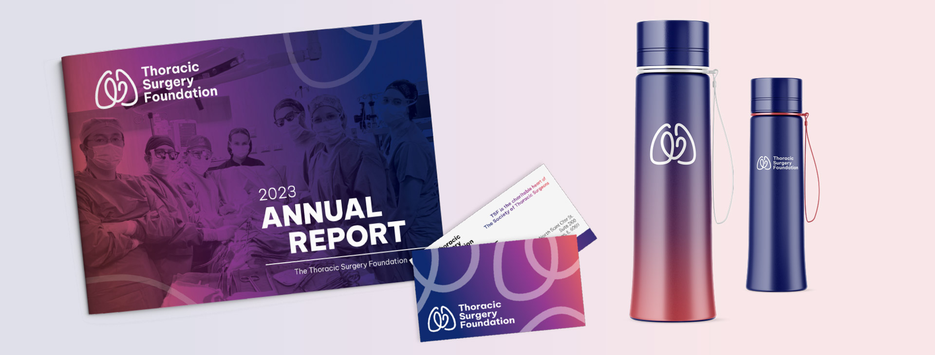
To protect and elevate the TSF brand over time, we also created a comprehensive Brand Standards Guide. This document provides detailed direction on logo usage, typography, color specs, spacing, and alignment with STS branding, ensuring that every touchpoint, whether digital or print, reinforces TSF’s mission and builds long-term recognition.

For an organization driven by generosity and scientific excellence, brand consistency is more than a design principle, it’s a promise of trust and impact.

Brand Colors For Thoracic Surgery Foundation
Tsf Materials Branding

The Results

The new identity has given TSF a fresh foundation from which to grow, fundraise, and connect with audiences in new and lasting ways. It reflects the strength of its past while welcoming a new era of philanthropy, innovation, and thoracic surgery leadership.

Award Badge

2024 MarCom Awards, Gold, The Thoracic Surgery Foundation Branding Refresh

Advancing Heart And Lung Health For All
Doctor Celebrating With Patient
Tsf Logo

A Brand That Honors Legacy While Embracing the Future

Orange Quote Marks

I believe that you are also submitting the branding work for award consideration, yes? (And I’m sure you’ll win as it is all SO GORGEOUS!)

In any event, thought you’d like to know as you were such a big part of the end product.

—Lee W., CAE, CFRE, Executive Director

Start Your Own Success Story