Marketing Insights
Pantone 2016 Color of the Year – it’s a blended pair!
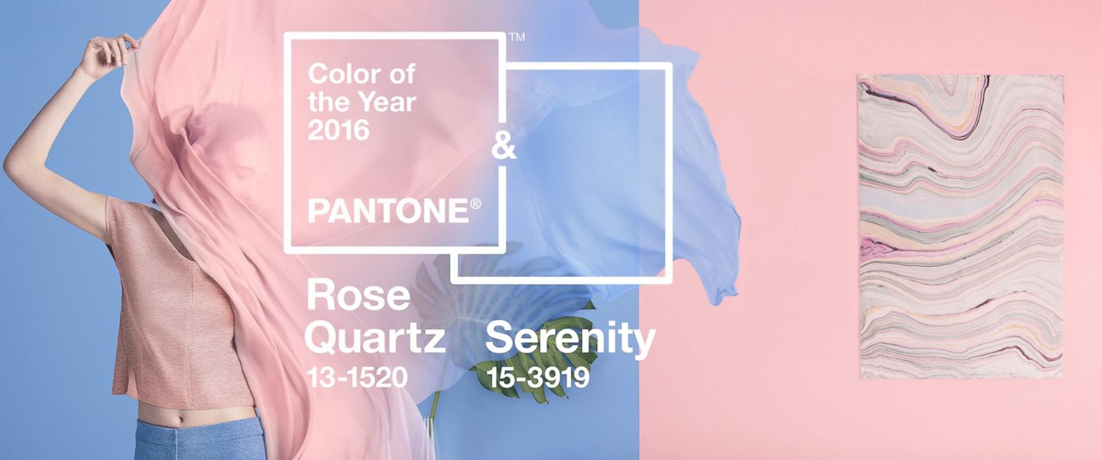
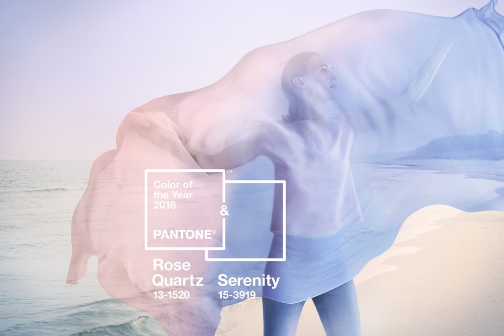
In an unexpected turn, the Pantone Color of the Year 2016 is not one color but a blend of two! Rose Quartz and Serenity are the PANTONE Color(s) of the Year 2016!
It’s the first-time ever, in Pantone’s Color of the Year’s 16-year history, that there has been two colors introduced as Color of the Year from Pantone. Pantone describes Rose Quartz as “a persuasive yet gentle tone that conveys compassion and a sense of composure.” Serenity is described as “weightless and airy, like the expanse of the blue sky above us, bringing feelings of respite and relaxation even in turbulent times.” The colors together bring a sense of calm and relaxation while challenging the traditional sense of color pairings. Both colors were featured among the 10 colors named in its September 10, 2015, Fashion Colors Report. The colors are likely to be used separate, but their strength is in the combination, according to Pantone.
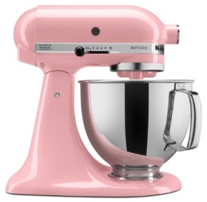
KitchenAid’s iconic Stand Mixer in Guava Glaze, a warm pink tone informed by PANTONE 13-1520 Rose Quartz.
Companies like Sephora, KitchenAid, and Thomas Pink have already unveiled special Rose Quartz-Serenity products – bringing Rose Quartz to beauty, kitchen countertops and luxury fashion. For the selfie-obsessed, you can tint your universe in Rose Quartz and Serenity, special filters are now being offered by the photo editing app Aviary.
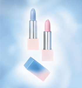
SEPHORA + PANTONE UNIVERSE Color of the Year Layer Lipsticks in PANTONE Serenity 15-3919 and PANTONE Rose Quartz 13-1520 ($18.00 each)
“With the whole greater than its individual parts, joined together Serenity and Rose Quartz demonstrate an inherent balance between a warmer embracing rose tone and the cooler tranquil blue, reflecting connection and wellness as well as a soothing sense of order and peace,” said Leatrice Eiseman, Executive Director of the Pantone Color Institute.
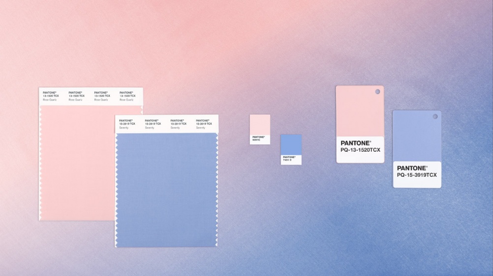
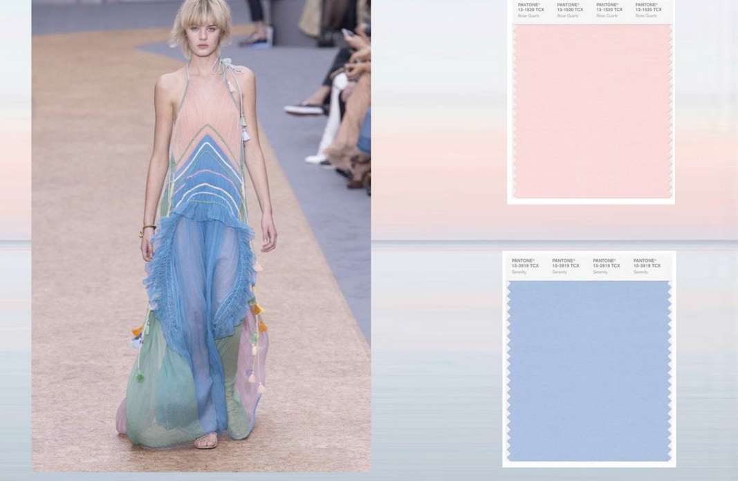
Rose Quartz and Serenity bring “a soothing sense of order and peace.”
In a press release from Pantone, Leatrice Eiseman, Executive Director of Pantone Color Institute, describes the color pairing as: “Joined together Rose Quartz and Serenity demonstrate an inherent balance between a warmer embracing rose tone and the cooler tranquil blue, reflecting connection and wellness as well as a soothing sense of order and peace.”
Our world is full of consumers and companies trying to find balance and have focused on wellness. This desire to find inner peace, reassurance and tranquility are representative in Rose Quartz and Serenity.
Tranquility and peace also come side by side in fun mixed applications like the Pantone Color of the Year Mug that each year features the Color of the Year from Pantone. One side of the mug is Serenity, and the other side is Rose Quartz.
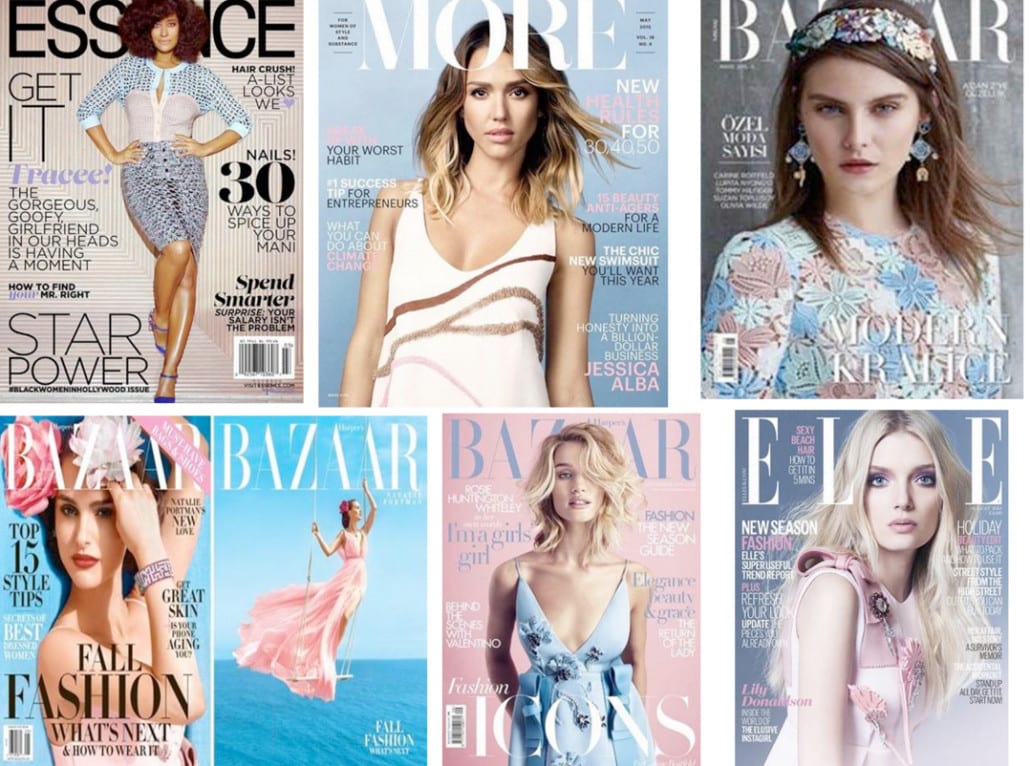
Magazine Covers featuring Rose Quartz and Serenity
Blurring the Gender Lines
Blue hasn’t always been for boys and pink hasn’t always been for girls. It was only since the 1940s that girls have been told to “Think Pink.” The years that followed linked pink as being a dominant color for women. In the 1980’s the Susan G. Komen foundation choose pink as their color to represent breast cancer awareness and their brand. Mattel’s Barbie was none other than pink. There are many decades where this division of gender by color has been engrained and made a lasting impression among people, especially in the United States — pink is for girls and blue is for boys. Pantone has seen trends that are breaking historical gender color barriers. Pantone, who has masterfully taken into consideration color trending and forecasting on a world-wide scale, says that you’ll see more and more boys wearing pink and girls wearing blue. You’ll see both blue and pink worn together on both men and women, seeing them used together in a pattern and also separately in color blocking. You’ll also see unisex outfits and fashion that is not gender specific but instead an expression of personality and treating the body as an artistic canvas. The lines of color separating genders have been blurring for some time. For example, in 2009, Brad Pitt wore a light pink suit at the Cannes Film Festival. A more current example is below from the UK of adorable little Prince George as he takes his first steps.
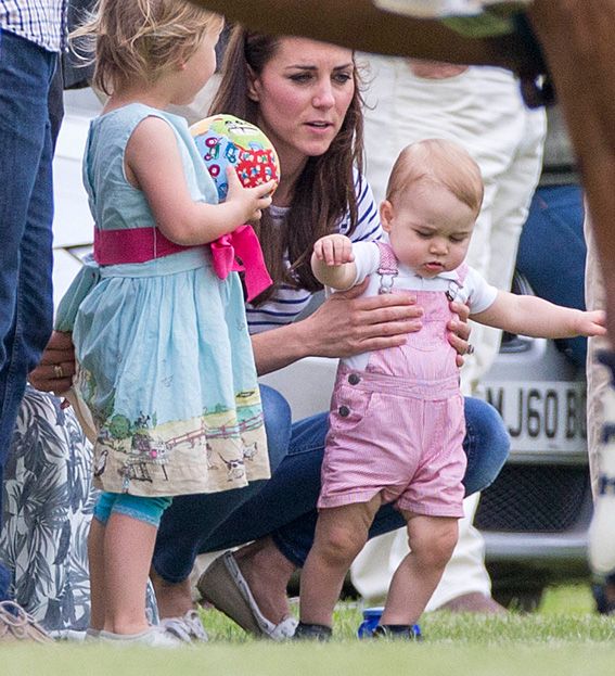
Gender specific colors are blurring. For example in the UK, adorable Prince George wears pink overhauls, while the little girl in the photo wears blue. (Photo by Max Mumby)
The Combination of Rose Quartz and Serenity Offer Exciting Color Pairings
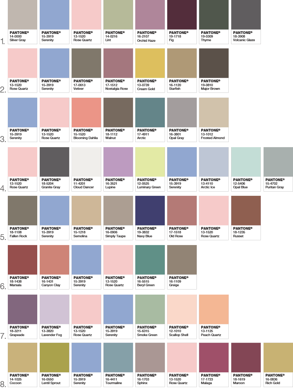
Both colors are appealing in all finishes, matte, metallic and glossy. Both can be paired with silver or hot brights for more splash and sparkle. With these exciting pairings, the engaging combo joins easily with other mid-tones including rich browns, greens and purples, and all shades of yellow and pink.
How does Pantone choose the Color of the Year?
The Pantone Color Institute conducts global trend analysis before coming to its decision. It’s a long and in-depth worldwide study with in-depth analysis before a selection is made. Pantone describes the process as, “a symbolic color selection; a color snapshot of what we see taking place in our culture that serves as an expression of a mood and an attitude.”
The Color of the Year announcement and selection influences graphic and web design, interiors, fashion and beauty industries, food industries affecting product development and purchasing decisions.
Influences come from across the world from:
- entertainment industry and films in production
- housewares
- traveling art collections and new artists
- fashion
- all areas of design
- popular travel destinations
- new lifestyles
- playstyles (distinctive and different approaches to game playing)
- socio-economic conditions
- new technologies, materials, textures and effects that impact color
- social media platforms
- up-coming attention-grabbing global sporting events
Read the press release from Pantone regarding the 2016 Color of the Year.
Looking for Color Direction and Insights? Contact Ocreative!
Ocreative offers color consulting for your brand colors, products and more. Check out our brand color consulting services or give us a call.
Color of the Year images courtesy of Pantone. PANTONE® and other Pantone trademarks are the property of Pantone LLC.

