Components Company
Logo | Color Consulting | Brand Standards Guide
Building a Contemporary Identity for a 90-Year Legacy
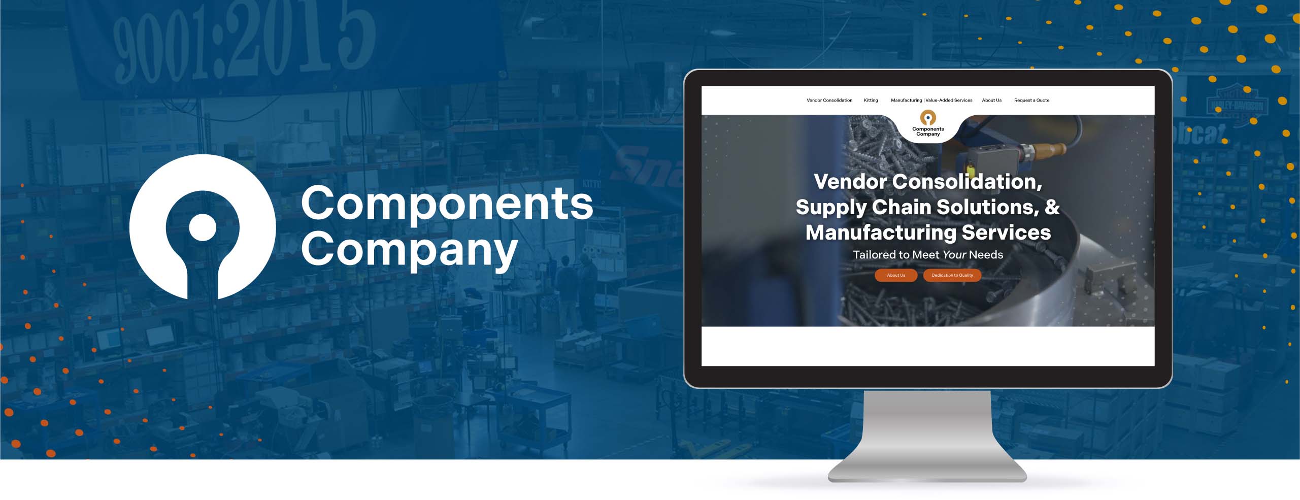
Since 1934, Components Company has been a trusted name in supply chain solutions, serving OEMs across agriculture, construction, automotive, and beyond. But after nine decades of growth and adaptation, their visual identity hadn’t kept pace with their expanding capabilities and forward-thinking approach.
Components Company needed a brand refresh that would honor their rich legacy while positioning them for the future, a visual identity that could communicate their innovation, reliability, and solutions-based approach to both longtime partners and prospective clients. They turned to Ocreative to craft a contemporary brand that would capture the essence of who they are today and where they’re headed tomorrow.


IN ACTION
Maintaining Consistency Through Strategic Guidelines
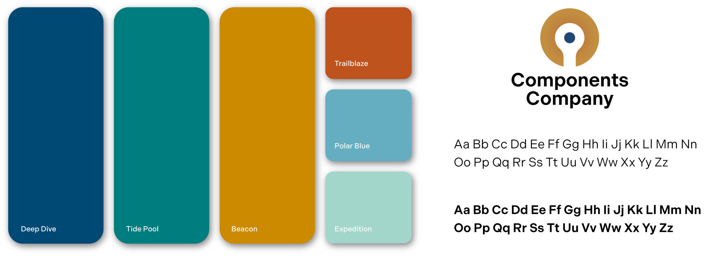
To ensure the refreshed brand maintains its integrity across all touchpoints, we developed a comprehensive Brand Identity Standards Guide. This essential resource provides clear direction on proper logo usage, color specifications for both print and digital applications, typography guidelines, spacing requirements, and examples of common misuses to avoid.
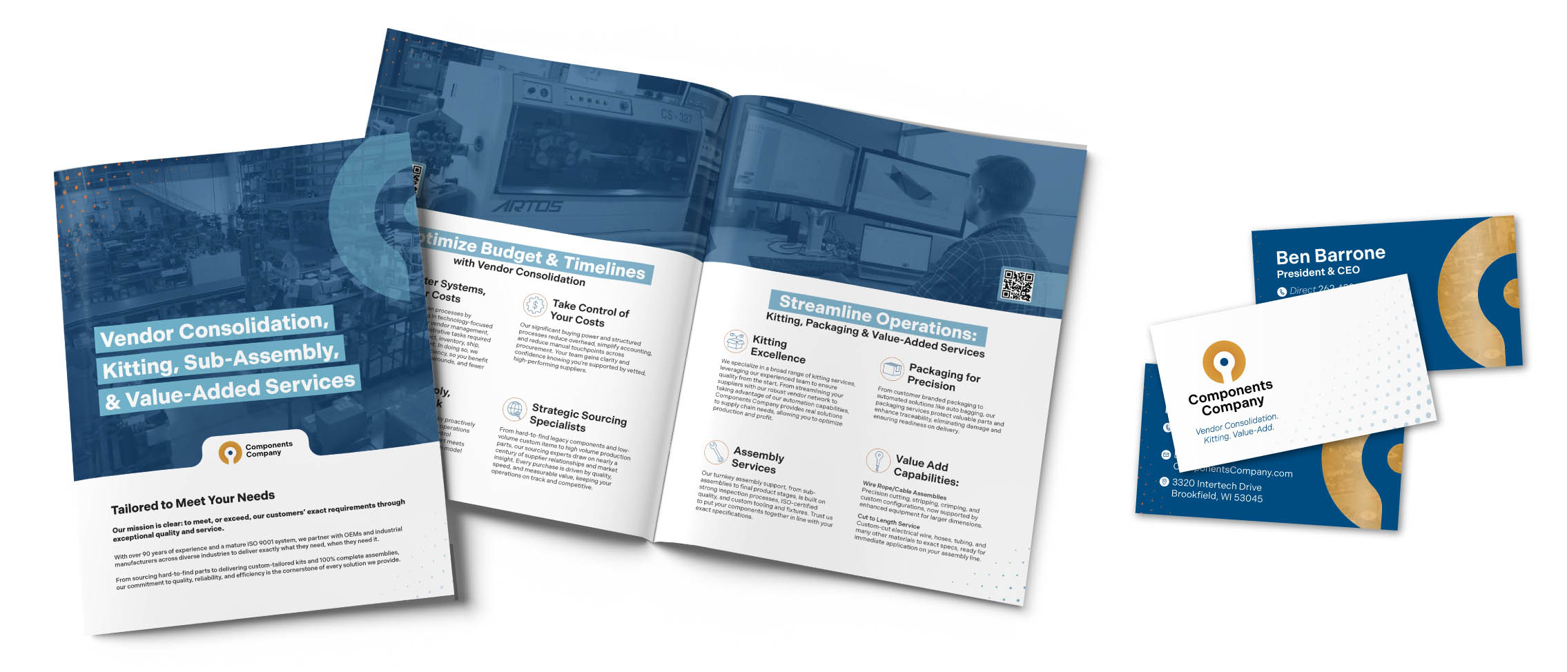
The guide empowers the Components Company team to confidently apply their new identity across diverse materials, from business cards and apparel to trade show displays and digital marketing. It includes specific instructions for different logo variations (full color, black, white, stacked, and horizontal formats) and explains when to use each version, ensuring the brand remains consistent whether it’s embroidered on uniforms, printed on promotional items, or displayed on their website and social media.
Most importantly, the Brand Standards Guide serves as a living reference that will support Components Company as they continue to grow and evolve. It provides the framework they need to maintain a cohesive, professional brand presence that resonates with OEMs across industries while allowing their 90-year legacy of quality and innovation to shine through every interaction.
2025 MarCom Awards, Gold, Branding Refresh


We partnered with Ocreative for a brand refresh and new website, and the experience was excellent. Their team took the time to understand our business and delivered creative ideas that captured our identity perfectly. The result is a modern, professional brand and a website that’s both beautiful and easy to use. We’ve already seen great engagement and couldn’t be happier. Highly recommend Ocreative!
– Jenny Nathan, Sales Associate, Components Company Inc.

