Brew Pipeline Branding

The Client

Brew Pipeline offers a series of innovative programs that open up craft brewers’ portfolios, allowing brand distribution to currently untapped markets. The team of industry veterans have identified and developed sales strategies that help craft breweries unlock their potential and drive products to new markets benefiting retailers, distributors, and beer lovers everywhere.

Communicatorawards_Icon 2020 SILVER AWARD OF DISTINCTION, CORPORATE IDENTITY & LOGO FOR A CORPORATION / BUSINESS, THE COMMUNICATOR AWARDS

The Request

Because the Brew Pipeline team was tackling distribution barriers to help craft breweries extend their reach and help distributors enhance their offerings, they wanted a brand that was easily identifiable with the beer industry and that was memorable. They approached Ocreative to generate a strong color palette, a custom logo, and custom typeface for their business.

The Strategy

Ocreative’s color expert began by interviewing surveying key Brew Pipeline stakeholders to get a comprehensive understanding of the business and their brand goals. Using a proprietary system of color theory and identification, we hand-selected a dynamic color palette that leaves an impression. With an emphasis on energy, this custom color palette features Midnight Run, a deep black that leans onto strong undertones of blue and hints of warming yellow accented by hot, dynamic, and energizing splashes of orange, yellow, and electric blue. A steep contrast between dark and bright hues make a bold statement that demands attention while the blue, Electric Star, defies the typical “cool” message of the blue family and leans more towards an intense blue, like the hottest gas flame. Color notes of water, hops, wheat, and amber play off deep colors to trigger thoughts of a cold frothy brew.

Branding_Brewpipeline_Colors
Branding Brewpipeline Guestbrewerlogo

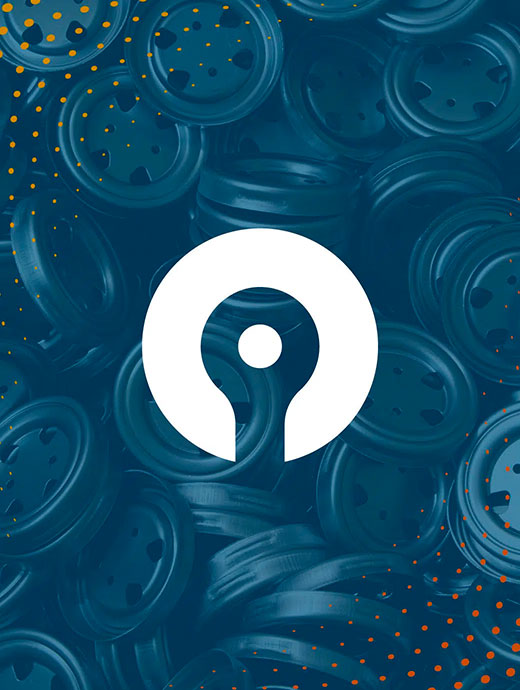
Along with the color palette, Ocreative designed a custom logo and mark. Starting with hand drawings, translating to a digital environment, and then refining the images, our graphic designers worked to create a logo that pairs the strength of tradition with energy of modernity. Taking inspiration from vintage drink ads, badge style layouts, and a series of keywords the Brew Pipeline team used to describe their business, our graphic designers came up with a logo that is both timeless and open to future growth for development of new Brew Pipeline programs.

The Outcome

The final brand creates a strong, dynamic, and energetic impression that melds perfectly with the beverage industry while standing out from the crowd. To reinforce the cool, approachable, and fun nature of the Brew Pipeline team, Ocreative developed a signature mark to go along with the brand, endearingly known as “Hop.” Hop, found in the bottom center of the logo, can be used on his own to signify the brand and looks like a combination of a hop leaf and a lion with a hidden drink chalice. Hop has become a quick fan favorite and has been perfect for branded merchandise.

Branding_Brewpipeline_Hops

RELATED PROJECTS