Marketing Insights
Why Image Matters: Enhancing the Experience of your Message
For any company selling a product or service, the website is one of the most effective tools in the marketing arsenal. It can also be one of the most devastating. It takes people .05 seconds, that’s the blink of an eye, to form an opinion about your website – and in turn, your company. An awesome web design inspires trust in your business, a bad one will have them turning away without another thought. According to web credibility research, 75% of people will admit that they judge a company’s credibility based on the website’s design. Content, is, and always will be, the most important – but, for that initial reaction, you need some great visual appeal. In fact, research shows that a great first impression can boost overall user satisfaction.
That being said, the initial design; with the branded colors, fluid layout and elegant fonts, in my opinion, only gets you about 95% of the way to that great first impression. The last 5% is what will make or break it. And what is that last bit? Images!
A site full of stock photography, bad photography, images that don’t clearly tie in with your message – all of these can serve as a pointless distraction and will have users hitting that back button before the page can fully load.So much of your company can be portrayed in just a quick glance with the right images – an image with story appeal can evoke a sense of curiosity and drive them further into your site. An image that accurately demonstrates your product or service can tell a user right away if they’ve found what they are looking for.

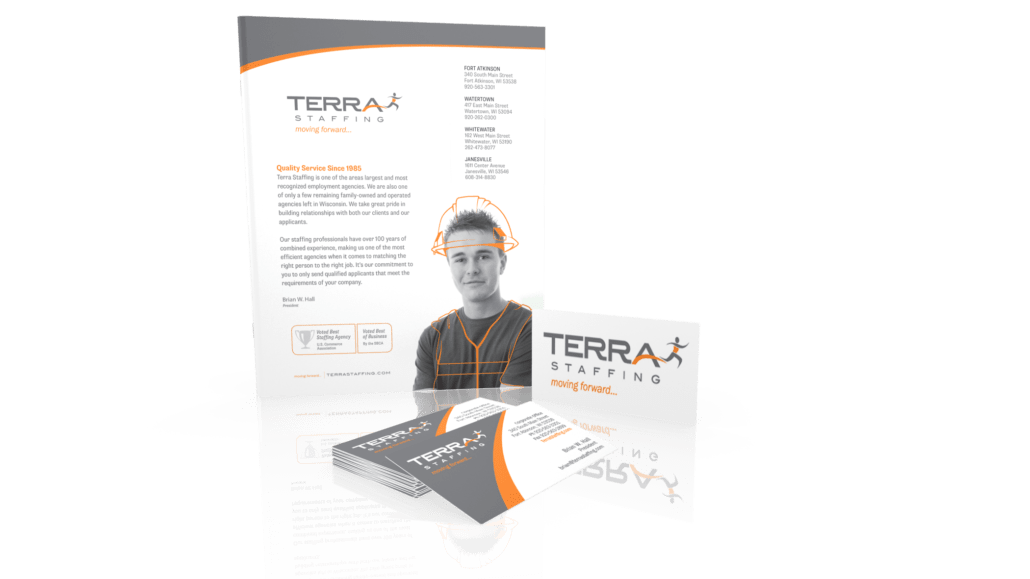
This image is from a job placement agency, Terra Staffing (brand identity and marketing collateral designed by Ocreative). Notice we keep the focus on the man, not a background or other people. This tells the viewer right away that this company’s focus is going to be on you.
To ease the pain of choosing at least some of the images that will to grab the user’s eye, there is a sure-fire way to do just that: Use people. People love people. It shows authenticity, friendliness and gives a feeling of being approachable.
- When using photos of people, try limiting it to one or two subjects. Crowd shots can be boring if there is no one to focus on.
- Head to mid-body shots work best. Our brains are wired to look at the face, so don’t distract them with more than they need.
- Use photos of people to incorporate your brand through colors, a uniform, your logo on a hat they’re wearing, etc.
- Try to have subjects look right out at the viewer, or towards a call to action on the site. Don’t make your viewer feel like they are being ignored.
- Try using real people from your staff, not actors or stock images. If you have to, try to make sure that they aren’t obviously so. Usually stock images are generic and lack imagination – just because it is attractive, doesn’t automatically mean effective.
Of course, you can’t just use images of people
If you sell a product, show the product. If you sell a service, you’ll need to show your process in action. No matter what images you choose to use keep one important thing in mind – it must be clearly tied to the central theme of your site. If you can’t write a convincing caption for the image, it’s not worth adding into your content (captions can get read more than body copy and are a great opportunity for some extra SEO). It’s easy to add in images just for decoration or to fill space, but this can distract your users, give them the wrong impression and take up space that could be used for actual information.
Users today don’t just want to browse a website, they want to experience it.
The right images can connect you with your target audience, add life to a site and boost conversion rates.
The bottom line is that something as simple as using the right image can make all the difference in world when you only have fractions of a second to make an impression.

