Marketing Insights
PART ONE: Understanding Your Google Analytics Report
Google Analytics is a great tool to understand how your website is doing and what areas need improvement. However, sometimes it can produce an overwhelming amount of data, making it difficult to know what reports to look at, or how to understand what that data is telling you. Well, don’t worry; that is where we come in! In this article, we will break down Google Analytics and talk about the important reports you should be looking at to improve your website.
THE BASICS
Let’s first talk about what you see when you log into Google Analytics and the important features you need to know about (www.google.com/analytics).
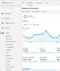
Left Side Bar:
This is where you find all the different sets of data and reports to run. They have broader categories, and each set expands to reveal more options. The most important categories are Audience, Acquisition, Behavior, and Conversions. You will be looking at these in a bit.
Date Range:
This is a simple feature, but a very important one. This determines the date range of the data you are looking at. Google automatically shows the last 30 days of your website activity. You can also compare data of two different date ranges. For example, if you make SEO improvements to your website, you can compare the data from before and after you made the changes, to see if there was an impact.


E-mail:
This will allow you to e-mail the report you have to anyone you would like. You can also set it up to allow Google to e-mail you the report every month, week, etc. with updated data.

Export:
This is where you can export the data you are looking at. This comes in handy when you need it in Excel, where the data can be exported directly.
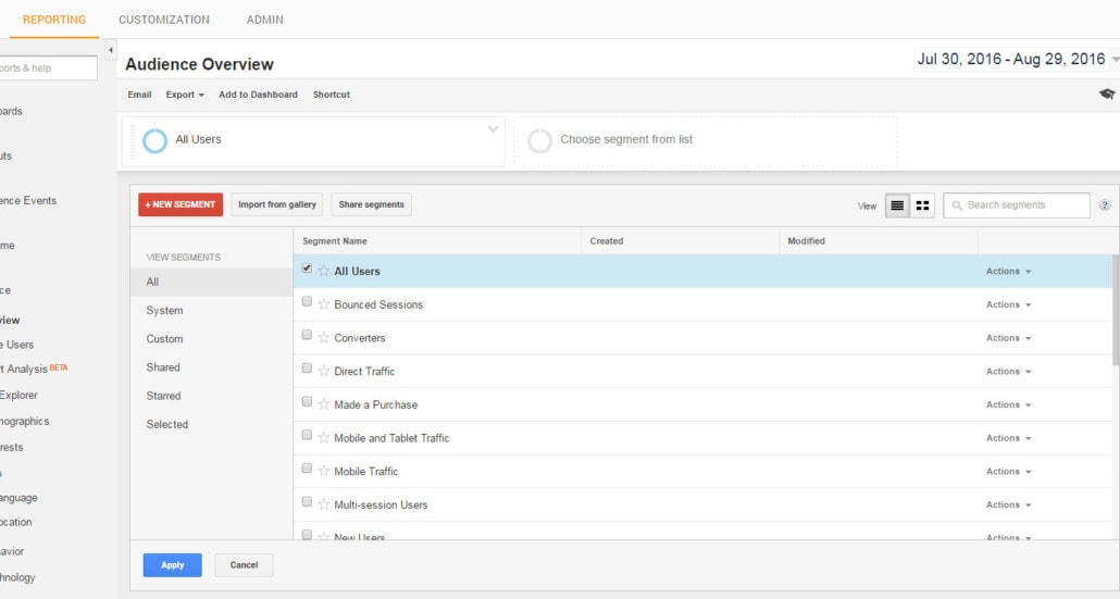
Segments:
This is used to compare different sets of data. The default is “All Users.” You can choose up to four segments to compare. This is where the CLEAN sessions you created will be.
IMPORTANT DATA TO LOOK AT
Graph:
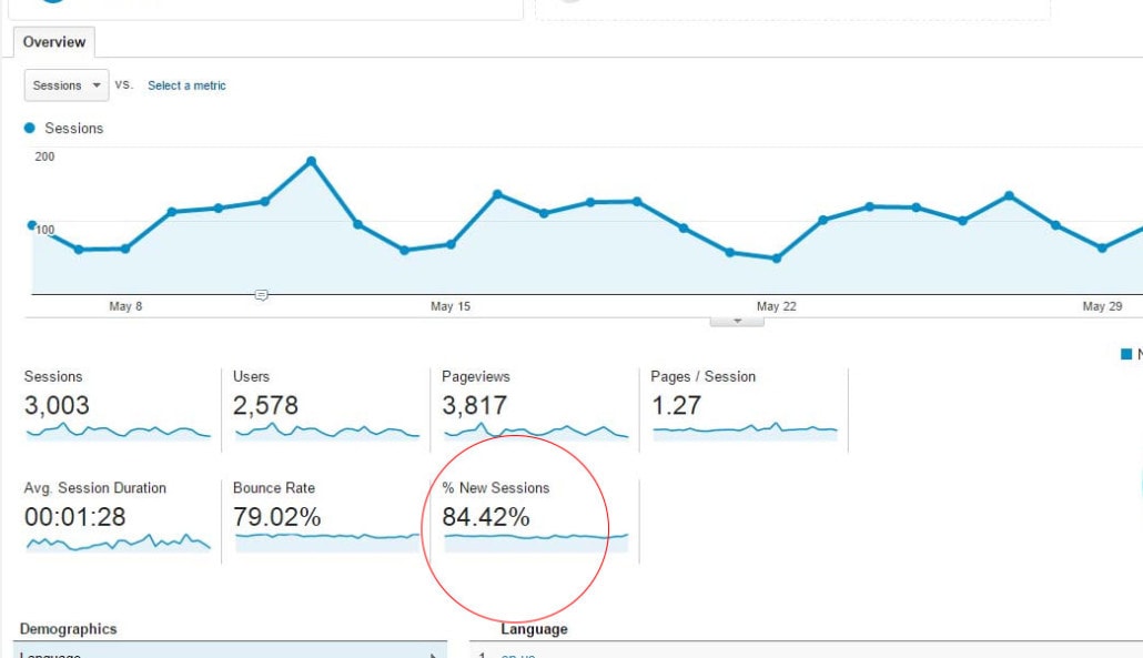
The graph is automatically plotting your sessions. You can change what the graph is showing by changing the metric. You can also compare one metric to another. The arrow underneath the graph will open annotations. Here, you can make notes on the graph that were important. For example, you can mark the day your website was revamped, the day your AdWords campaign started to run, or when new content was added to your website. Unfortunately, you cannot just export the graph; only data will export. You can, however, export the whole dashboard to a PDF.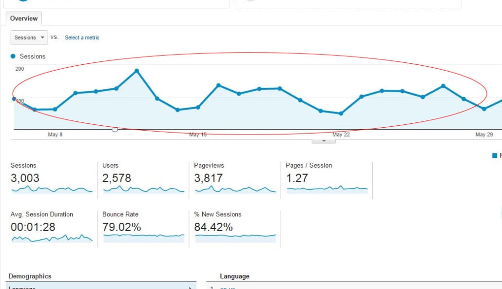
Sessions:
This was formerly known as “Visitors.” This represents the number of times a user was active on your website. A session will reset after 30 minutes of inactivity, or at the end of the calendar day. This metric does not recognize users; it will count a new session if the user has been to your site before.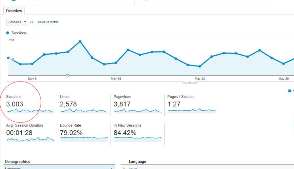
Users:
This was formerly known as “Unique Visitors.” This represents the number of people who have come to your site. Even if they have visited your site multiple times, it will only count as 1 user.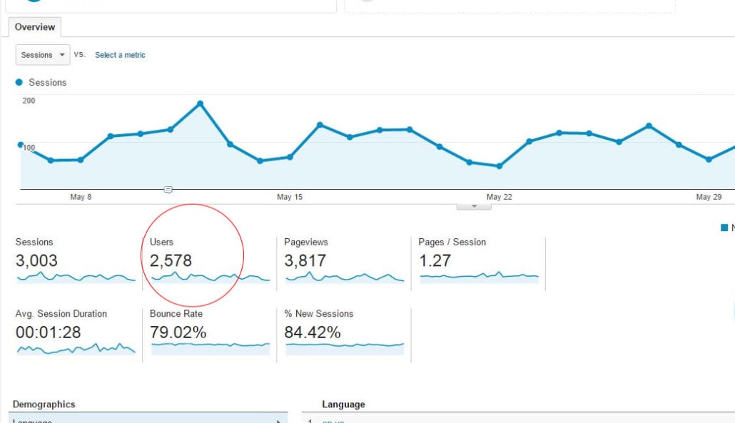
Page Views:
This represents the total number of pages that were viewed on your website. This includes repeated site users and repeated page views.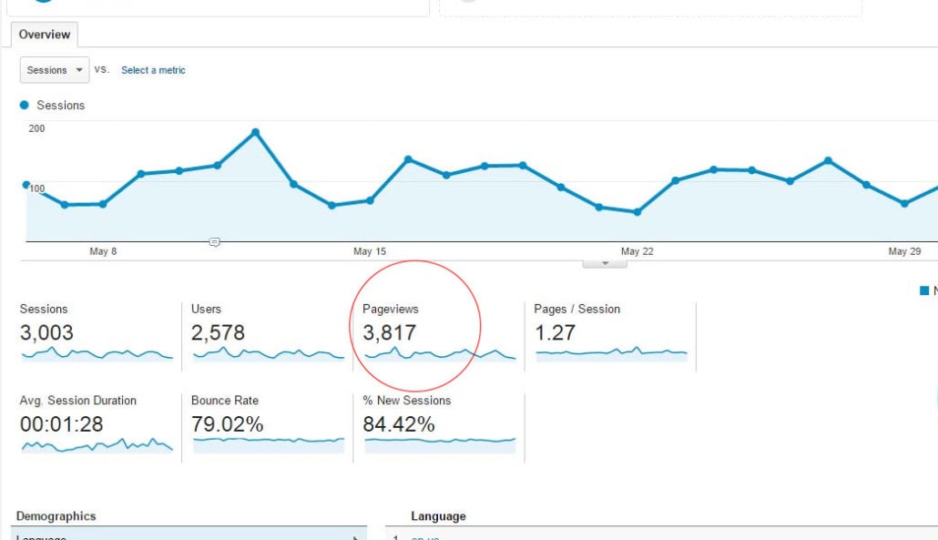
Pages/Session:
This represents the average number of pages that were viewed in a session. This includes repeated page views.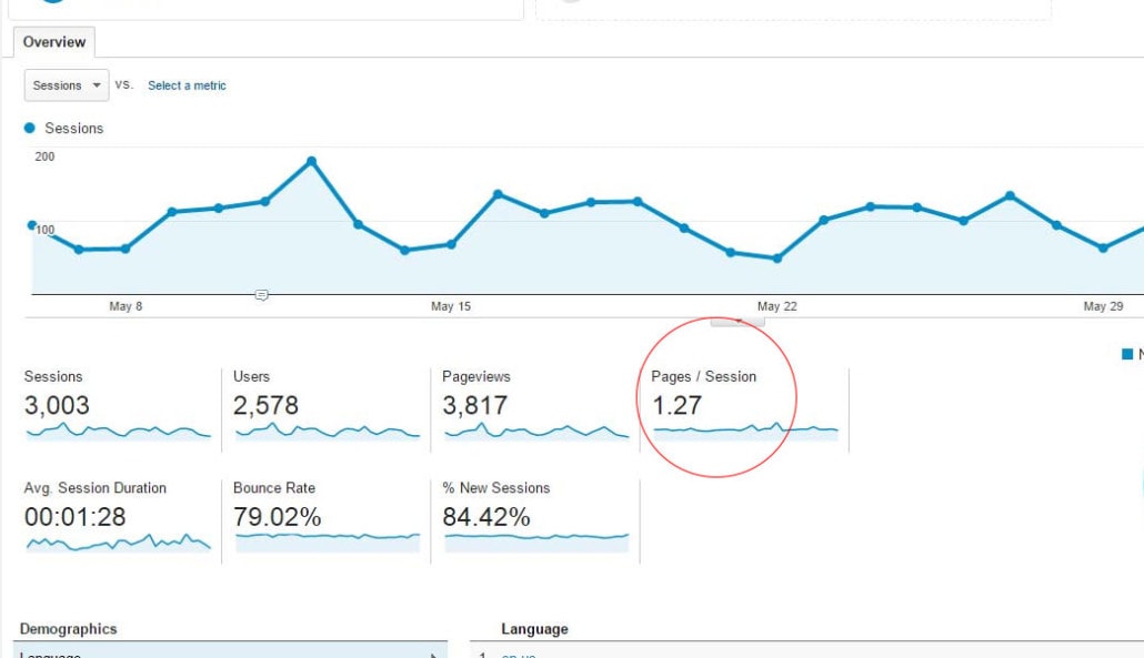
Average Session Duration:
This represents the average amount of time a user spends during a session on your website.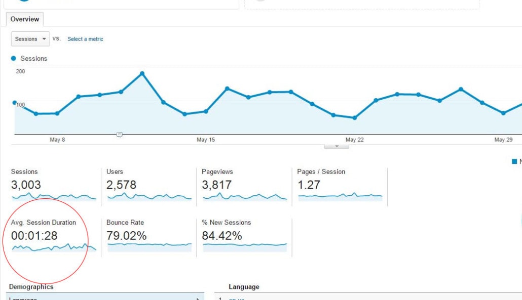
Bounce Rate:
This is the percentage of users who only visit one page of your website and leave. They do not visit any other pages. Normally, you want this rate to be as low as possible. A good average rate is 40 to 60 percent. If you have content that answers a user’s question and you want that person to only go to one page of your website, then a high bounce rate would be desired. It all depends on the content and if your end goal is to have the user explore your website.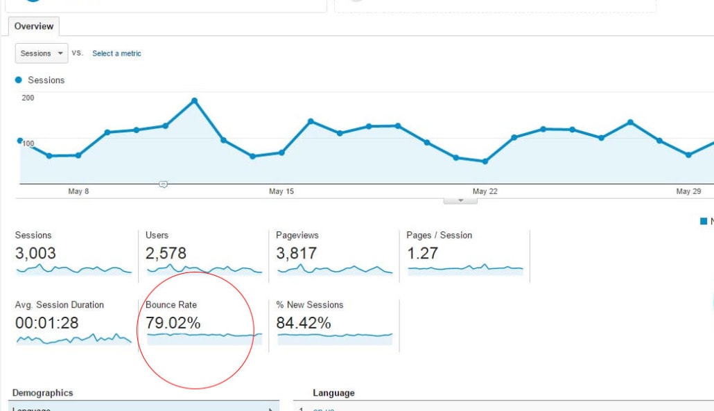
Get the Next Article in our 6-Part Google Series!
Next up in our Google series is "Our Favorite Google Analytics Reports" so you won't want to miss it! Have the article delivered to your email by signing up below.
About Ocreative
Ocreative is an award-winning, fully integrated marketing agency whose work features some of the best forward-thinking organizations and B2B companies. The agency began in 2003, and since then they’ve carved out a specialization for themselves with nonprofits and business-to-business companies. Their portfolio expertly includes branding, digital marketing, website design and development, graphic design, video storytelling, color consulting, and more.

