Marketing Insights
Information Architecture in Under Five Minutes
While it’s not an entirely new concept, Information Architecture (IA), is the newest buzz phrase circulating web development agencies. While generally used in tandem with UX and web development, IA is more multi-faceted than that. IA principles can be used across the board, any time users are interacting with a product or brand experience – from websites to print to the products themselves. But what is Information Architecture?
Defining Information Architecture
Peter Morville, a “founding father” of IA, or more aptly, one of the first professionals to recognize the trend in information grouping defines Information Architecture as “The organization, search, and navigation systems that help people to complete tasks, find what they need, and understand what they’ve found.” (Peter Morville) In short, it’s a thought and design process that focuses on organizing, structuring, and labeling content in an effective and sustainable way. (usability.gov)
Think of a library – even if the building is beautiful, the aisles are wide, and the shelving is strong and plentiful, it all means nothing if the books are not organized in a way that allows people to find them easily. It’s the same for marketing materials and websites. It doesn’t matter if they look good; you can’t use what you can’t find or don’t understand.

IA for Website
Information architecture defines the layout and delivery of information across multiple forms of media. Commonly used in website design and development, IA outlines how information is displayed and determines the internal structure of a website. After thorough research of a product or service, its market, and target audiences, a marketer versed in IA will use basic UX theory and human psychology to determine the best way to group information, so it is easy for users to find and use.
Creating Information Structures
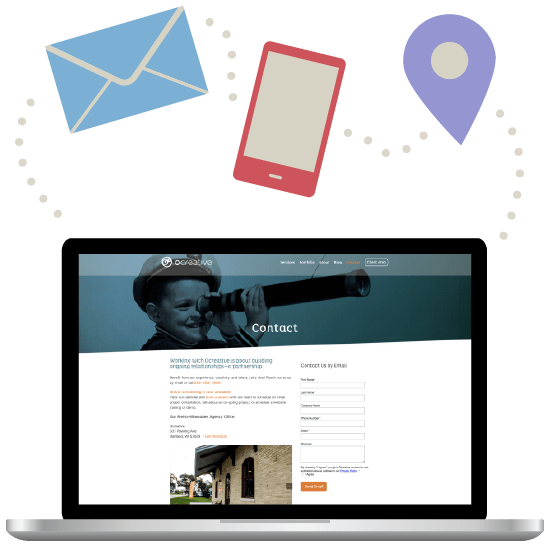
Grouping like-information can be done in a number of ways and should be dependent on the needs of the user and the action required by the brand. For example, the “Contact Us” page is generally uniform across all sites, but I bet you never thought about why. As users, we need a series of basic information to reach out to businesses: the phone number, email, and sometimes location.

Rather than having this information hidden within other information structures throughout the site, we pull it out, group it together, and give that set of data its own label: “Contact.” Users don’t generally notice a contact page unless its missing. Information grouping uses these kinds of user needs and expectations (known as mental modals) to determine how to best group information to make it easier to find and use.
Content Labeling
Properly labeling information is another key principle of IA. Creating navigation menus that accurately reflect the content of each page is a crucial step in helping users find important information to take action. Once information has been grouped, we use labels to clearly define that grouping structure. These labels take on various forms including menu titles, header and sub header information, and even button copy. Information and labeling strategies are based on a number of factors. We could start reviewing Gestalt’s psychology or information hierarchy, but we’ve only got five minutes, so we’ll leave that for another time. Long story short, you need to tell people what their getting into, and giving a clear header (title) is the best way to do it. It’s even more effective if those titles drive the user to a specific action desired by the business (IE – purchasing a product or submitting information.)
Print Applications for IA
Information Architecture, however, is not limited to the digital landscape. Great graphic designers use important principles in IA to design everything from flyers to invitations to catalogs. Creating a clear message and driving action is dependent on understanding the goal of the print piece and the way in which end users will interact with it. Think about a catalog for a moment – you automatically expect to see some sort of table of contents in the front, products in the middle, and some kind of index at the back.

Great designers take those basic expectations and use imagery and varying typeface to draw the eye to crucial information. They also use information grouping to ensure end users can find the information they need where they most expect it. It sounds like common sense, but there is a fine art to distilling complex information into a palatable and easy-to-understand document and it’s noticeable when it’s not done well.
If you’re interested in learning more about information architecture and how to enhance your website and print initiatives, let’s chat!
About Us
Ocreative is a Milwaukee marketing agency, with expertise and broad experience in developing digital marketing strategies, and growing their online presence, for their clients. The company’s core values include offering the highest level of customer service, award-worthy quality, and performance that surpasses client expectations. Ocreative is located just outside Milwaukee, and works with clients locally, nationally, and globally. Their clients have access to some of the most fun and knowledgeable professionals around – ones who inspire, educate, and problem solve. The agency provides marketing and brand strategy, advertising and design, website design and social media, and video expertise to their clients, fulfilling their desire for business growth, and their aspiration to make a mark on their industry.

